- Published on
Mastering Engineering Performance Indicators
- Authors

- Name
- Gabriel
- @gabriel__xyz
Engineering performance indicators, or EPIs, are the metrics you track to get a real, measurable handle on your software team's effectiveness, quality, and speed. They're what take you from guesswork to data-driven decisions, helping build a culture where improvement is constant, not just an occasional goal.
Why Engineering Performance Indicators Matter
Think of EPIs as the instrument panel for your software team. A pilot wouldn't fly a plane on gut feelings alone; they rely on instruments for altitude, speed, and engine health. In the same way, EPIs give leaders clear, objective insights into their team's velocity, quality, and the overall health of a project. They create a shared, objective view that gets everyone on the same page.
To really get a grip on EPIs, it helps to understand the bigger picture of performance measurement and how it applies in different fields. At its core, it's all about turning abstract goals into solid data points.
The point isn't to micromanage—it's to build a system for sustainable success. When you measure the right things, you can:
*   **Spot Bottlenecks:** Pinpoint exactly where things are slowing down in your development cycle, whether it’s code review, QA, or somewhere else.
*   **Improve Predictability:** Get much better at forecasting delivery timelines, which builds a ton of trust with stakeholders and other departments.
*   **Boost Team Health:** Catch early signs of burnout or process friction before they start to drag down morale and productivity.
*   **Drive Smarter Decisions:** Allocate your resources more effectively because you have real data showing what's working and what isn’t.
From Ambiguity to Actionable Insight
Without clear EPIs, teams are often flying blind, relying on vague feedback or just a "feeling" that things are slow. This leads to scrambled priorities and wasted effort. For instance, a team might feel sluggish, but they don't know why. Is it because pull request reviews are taking forever? A high number of bugs causing constant rework? Or are the tasks just too complex? EPIs cut through that ambiguity with hard data.
Metrics like code churn and cycle time have become non-negotiable in software engineering. One report found that top-performing engineering teams deploy code a staggering 208 times more frequently than their lower-performing peers. Even more telling, the median cycle time for these elite teams is under an hour, while low performers are averaging over 24 hours. That massive difference shows a direct line between tracking targeted metrics and achieving better outcomes.
The purpose of measuring is not to control, but to gain knowledge. By turning observations into data, you create the foundation for meaningful improvement and informed conversations about your engineering processes.
When you track the right metrics, you create a feedback loop that fuels continuous improvement. This data-first approach is the bedrock of modern software development, helping teams build better products, faster and more reliably. For a deeper dive, make sure to check out our complete guide to engineering productivity measurement.
The Four Pillars of Software Engineering Metrics
Measuring engineering performance isn't just about raw speed. If you chase velocity and ignore quality, you’re basically building a race car with a sketchy engine—it might look fast, but it’s going to break down. To get the full picture, you need a balanced framework. This framework is built on four interconnected pillars that give you a true, 360-degree view of how your team is really doing.
When you look at these pillars together, they tell a complete story. A sudden spike in velocity feels like a win, but if it comes with a drop in quality, you’re just kicking the can down the road and creating future headaches. Likewise, a hyper-efficient process is great, but not if it’s burning out your team.
This map shows how the four pillars—Velocity, Quality, Efficiency, and Team Health—all connect to create a holistic view of engineering performance.
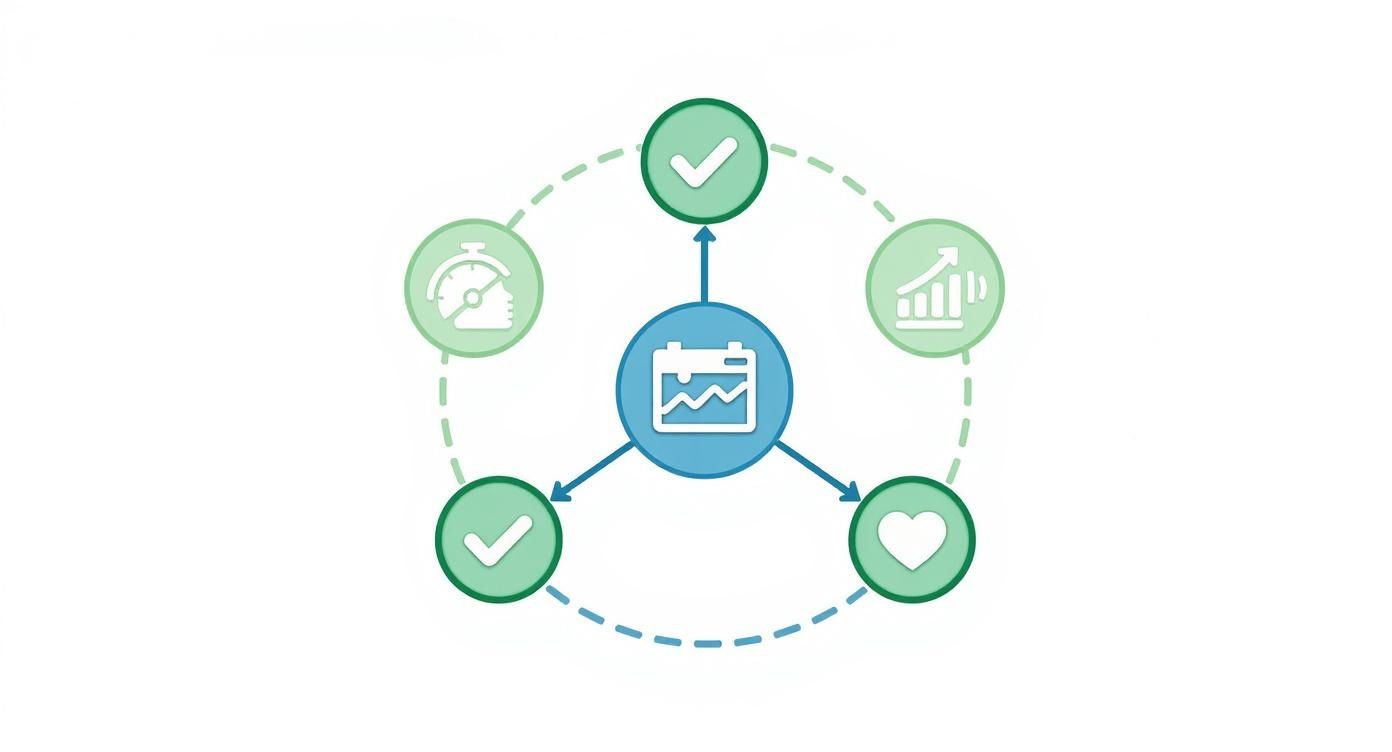
As you can see, each pillar covers a distinct yet related part of performance. This ensures you’re never looking at a single metric in a vacuum.
Pillar 1: Velocity
Velocity metrics get straight to the point: how fast can your team ship value to users? Think of this pillar as the speedometer on your engineering dashboard. These are the most direct measures of your team's output and their ability to get things done.
Some classic velocity metrics include:
*   **Deployment Frequency:** This is simply how often your team successfully pushes code to production. Top-tier teams often deploy multiple times a day, which allows for much faster feedback loops.
*   **Cycle Time:** This tracks the total time from the first commit on a piece of code all the way to its deployment. A shorter cycle time means ideas are becoming user-facing features faster. To learn more, check out these [proven strategies to reduce cycle time in 2025](https://blog.pullnotifier.com/blog/7-proven-strategies-to-reduce-cycle-time-in-2025).
*   **Lead Time for Changes:** This is a bit broader than cycle time. It measures the clock from the moment a feature is requested until it’s delivered, giving you a wider view of the entire delivery pipeline.
Pillar 2: Quality
So, velocity tells you how fast you’re moving, but quality metrics tell you how well you’re building. This pillar is the bedrock of long-term success. It’s what keeps speed from turning into a fragile, bug-infested product. Remember, poor quality just creates rework, which kills your velocity anyway.
Key indicators of quality are:
*   **Change Failure Rate (CFR):** What percentage of your deployments cause a production failure, like an outage or a show-stopping bug? A low CFR is a huge signal that your release process is stable and reliable.
*   **Mean Time to Recovery (MTTR):** Failures are inevitable. When they happen, this metric tracks how long it takes to get things back up and running. A low MTTR shows your team is resilient and can handle incidents effectively.
*   **Escaped Defects:** This metric counts how many bugs slip past your defenses and are found by actual users after a release. It’s a direct indicator of gaps in your testing and QA processes.
Pillar 3: Efficiency
Efficiency metrics are all about looking inward at your development process. They help you spot and eliminate the friction, waste, and bottlenecks holding your team back. If velocity is your speed, then efficiency is your fuel economy—it shows just how smoothly your engine is running.
Focusing on efficiency isn't about pushing developers to work faster. It's about removing the obstacles that stop them from working smarter. You’re optimizing the system, not micromanaging the people.
Consider tracking these efficiency metrics:
*   **Code Churn:** This measures how often code is rewritten or deleted soon after it’s been committed. High churn can be a red flag for unclear requirements, lingering technical debt, or fundamental design flaws.
*   **Pull Request (PR) Pickup Time:** This is the time that ticks by between a PR being opened and a teammate actually starting the review. Long pickup times are one of the most common bottlenecks in any dev workflow.
*   **Time in QA:** How long do features sit in the testing phase? Tracking this can expose bottlenecks in your QA process or hint that code is being shipped with too many initial bugs.
Pillar 4: Team Health
The final—and arguably most important—pillar is team health. You can have the most dialed-in processes in the world, but they’ll fall apart if the people behind them are burnt out, disengaged, or overloaded. These indicators are your early warning system for burnout and satisfaction issues.
Important team health metrics include:
*   **Developer Satisfaction:** This is a qualitative metric, but it’s invaluable. You can measure it through regular, honest surveys and one-on-ones to get a direct pulse on team morale.
*   **Workload Balance:** Take a look at how tasks, PR reviews, and complex tickets are distributed across the team. This can help you spot and prevent individual burnout and identify any single points of failure.
*   **Focus Time:** This metric tracks the amount of uninterrupted time developers have for deep, focused work, as opposed to time spent in meetings or fighting fires.
By keeping these four pillars in balance, engineering leaders can build a culture of sustainable high performance—one where teams ship fast without sacrificing quality or their own well-being.
How to Calculate and Track Key Metrics
Knowing what engineering performance indicators are is one thing, but the real magic happens when you actually start using them. This is where we move from theory to action, turning abstract goals into hard data that can genuinely drive improvement.
Let's walk through how to calculate a few of these core metrics. More importantly, we'll look at the story each number tells about your team's development process. Getting this right is the first step toward building a predictable and efficient engineering org.
Calculating Core Velocity and Quality Metrics
To get started, you don't need to track everything. Just focus on a few high-impact indicators that give you a balanced view of your team's health. Chasing speed without watching quality is a recipe for burnout and bugs.
Here are three essential metrics to kick things off.
1. Cycle Time This is the big one. It measures the entire journey of a piece of code, from the developer's very first commit all the way to its deployment in production. It directly answers the question, "How long does it take for an idea to reach our users?"
*   **Formula:** `Cycle Time = (Date of Production Release) - (Date of First Commit)`
*   **What it tells you:** A short cycle time is a sign of a healthy, low-friction development process. If you see this number start to climb, it’s a warning light for bottlenecks—maybe code reviews are slow, or the testing phase is a slog. Improving this is huge, and you can find several [key metrics for faster code reviews in GitHub](https://blog.pullnotifier.com/blog/key-metrics-for-faster-code-reviews-in-github) that feed directly into a shorter cycle time.
2. Change Failure Rate (CFR) Your CFR tracks the percentage of deployments that go wrong and cause a failure in production. Think rollbacks, hotfixes, or any other emergency fix. It's a direct pulse check on the stability of your release process.
*   **Formula:** `Change Failure Rate = (Number of Failed Deployments / Total Number of Deployments) * 100`
*   **What it tells you:** A low CFR means your testing and QA processes are solid. If it starts to creep up, that's a major red flag that you might be pushing code out the door too fast, sacrificing quality for speed.
3. Deployment Frequency This one’s simple: how often does your team successfully ship code to production? It’s not about deploying for the sake of it, but about showing you can ship whenever you need to. High-performing teams often deploy multiple times a day.
*   **Formula:** `Deployment Frequency = Total Number of Deployments / Time Period (e.g., per day, per week)`
*   **What it tells you:** Frequent, successful deployments point to an agile team with a healthy CI/CD pipeline. It means you can get value to users, fix bugs, and respond to feedback in a flash.
Tracking these metrics isn't about pointing fingers or judging individuals. It's about diagnosing the health of the entire system—the workflow itself. The real goal is to spot the friction points and work together as a team to smooth them out.
Automating Data Collection with the Right Tools
Let's be honest, calculating all of this by hand is a nightmare. It's tedious, error-prone, and no one has time for it. Luckily, a new wave of engineering intelligence platforms does the heavy lifting for you by plugging directly into the tools you already use, like GitHub, GitLab, and Jira.
These platforms act as a single source of truth, so you can finally ditch the spreadsheets and get real-time insights.
*   [**LinearB**](https://linearb.io/): Connects development pipeline data with project management info from tools like Jira to give you rich, contextual insights.
*   **Velocity (by Code Climate)**: Gives a broad view of engineering momentum, helping teams spot bottlenecks and improve how they deliver.
*   [**Jellyfish**](https://jellyfish.co/): Focuses on connecting what engineers are building with the bigger business goals, translating dev work into strategic impact.
These tools handle the data crunching, which frees up your team to focus on what actually matters: analyzing the trends and making smart improvements to your process. Understanding how goal setting and tracking enhance performance can connect your engineering efforts to wider business outcomes. Once you have a solid data foundation, you can start making smarter, faster, and more reliable decisions.
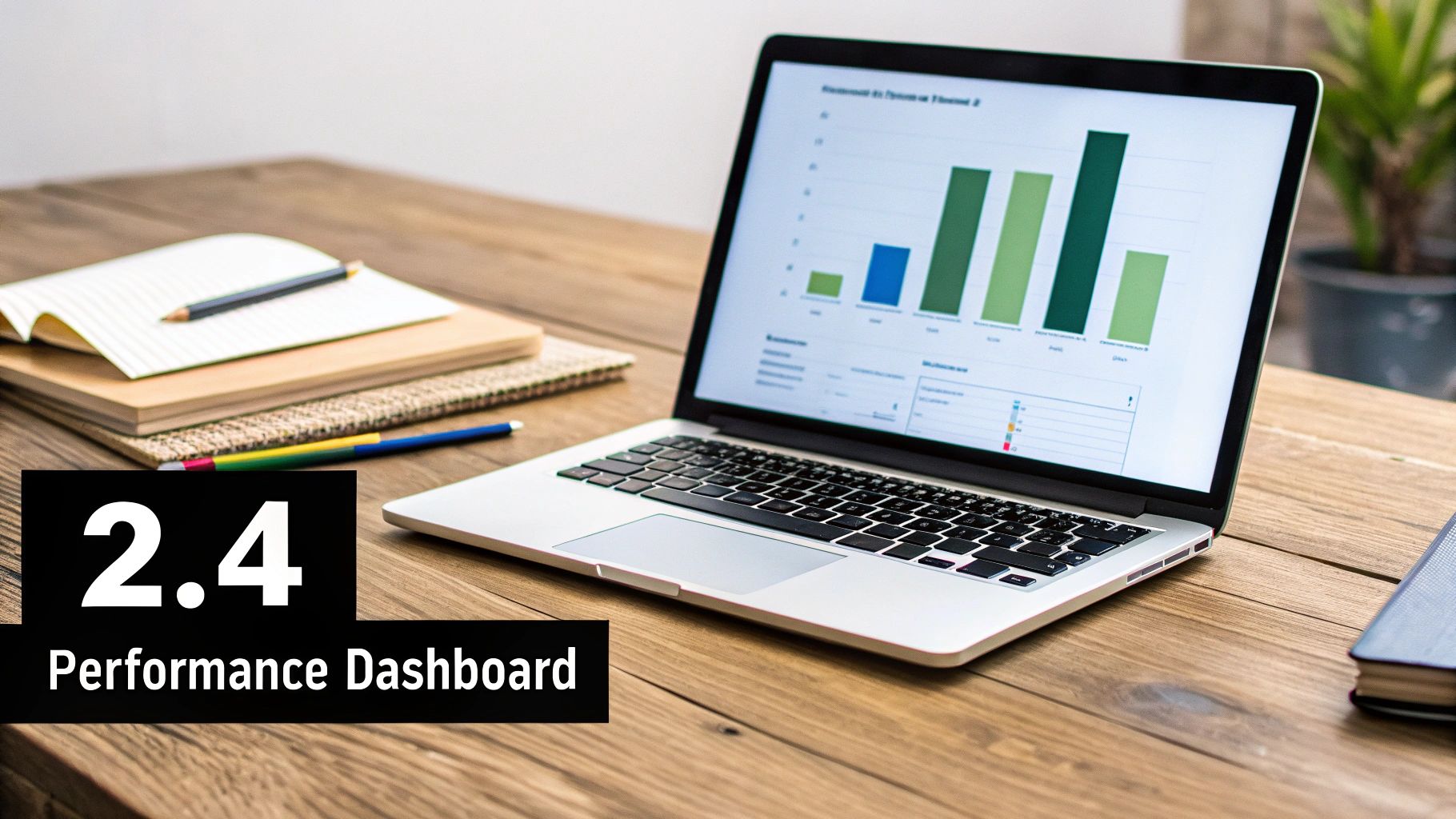
Building an Effective Engineering Dashboard
Raw data on engineering performance is just a pile of numbers. A well-designed dashboard is what turns that noise into a clear story. Think of it as the difference between a heap of engine parts and a car that’s ready to drive. The dashboard assembles individual metrics into a cohesive picture that shows you trends, highlights progress, and flags problems before they get out of hand.
A great dashboard gives you insights you can actually use, tailored to whoever is looking at it. An engineering manager needs a close-up view of their team's sprint progress. A CTO, on the other hand, needs a high-level summary of the entire organization's delivery speed and stability. The whole point is to get the right information to the right person when they need it.
This isn’t a new concept, and it's not just for software. The wider architecture and engineering industry has seen huge wins from this approach. A recent benchmark report found that 100% of firms using project management software saw a major efficiency boost, with project delivery times cut by an average of 18%. That success comes from using real-time performance dashboards to make smarter decisions. You can dig into the details in the 2025 Architecture and Engineering Industry Benchmark Report.
Designing for Clarity and Action
The best dashboards strike a balance between different types of metrics. This helps you avoid the classic trap of optimizing for one thing at the expense of another. For example, if you track a velocity metric like Deployment Frequency, you should pair it with a quality metric like Change Failure Rate. That way, you know you’re not just shipping faster—you’re shipping better.
How you visualize the data is just as important. Different charts tell different stories:
*   **Line Charts:** These are perfect for tracking how a metric changes over time. Use one to show how your team's **Cycle Time** has improved over the last quarter.
*   **Bar Charts:** Ideal for comparing things in distinct chunks of time. A bar chart is great for looking at weekly **Deployment Frequency** or comparing **PR Pickup Times** across different teams.
*   **Gauges and Single Numbers:** These are fantastic for a quick, at-a-glance status of a critical metric, like your current **Change Failure Rate**.
A dashboard should be a conversation starter, not just a report card. Its job is to make you ask questions like, "Why did our cycle time spike last week?" or "What can we learn from the team with the lowest change failure rate?"
By combining these elements, you create a balanced view that helps build a healthy, sustainable, and high-performing engineering culture.
Visualizing Performance with Modern Tools
You can build powerful, custom dashboards with tools like Grafana, but you'll often get more value right out of the box from specialized engineering intelligence platforms. These tools plug directly into your development workflow, automating data collection and presenting it with all the right context.
Here’s an example of what a team performance dashboard from LinearB looks like, blending a few key metrics into one view.
This dashboard does a great job of combining metrics like Cycle Time, PR Size, and Planning Accuracy to give a complete snapshot of the team's health and productivity.
Creating a Balanced Dashboard Template
When you're putting together your first dashboard, it’s best to start with a simple template that covers the core areas of performance. This makes sure you're looking at the whole picture from day one.
Dashboard Template Example:
| Category | Primary Metric | Secondary Metric | Visualization |
|---|---|---|---|
| Velocity | Cycle Time (Trend) | Deployment Frequency | Line Chart & Bar Chart |
| Quality | Change Failure Rate | Escaped Defects | Gauge & Number |
| Efficiency | PR Pickup Time | Code Churn | Bar Chart & Line Chart |
| Team Health | Workload Distribution | Focus Time | Pie Chart & Number |
Think of this structure as a starting point that connects speed with stability and process efficiency with your team's well-being. At the end of the day, your dashboard is a living tool. Keep tweaking it based on feedback and your company's goals to make sure it stays a source of truth that drives real improvement.
Common Mistakes When Implementing EPIs

Rolling out engineering performance indicators can be a huge win, but let’s be honest—metrics are powerful, and they can be misused just as easily as they can be used for good. If you aren't careful, the best intentions can quickly curdle into a culture of fear, distrust, and developers gaming the system.
The secret is to frame EPIs as tools for improving the system, not for judging the people within it. Get that right, and you’ll get the team on board and see real, lasting improvements.
Weaponizing Data for Performance Reviews
Want to kill trust in your metrics program overnight? Tie them directly to individual performance reviews. The moment developers think their next promotion or job security hinges on hitting a specific number, they will optimize for that number. Quality and collaboration will almost always take a backseat. This breeds a competitive, zero-sum environment where nobody wants to touch the tricky, time-consuming tasks that don't move the needle on their personal stats.
Instead, let the data spark conversations about the workflow. For example:
*   "Looks like our team's cycle time is creeping up. Is there a bottleneck in the review process we can tackle together?"
*   "Change Failure Rate ticked up last month. Do we need better testing support, or maybe clearer requirements upfront?"
Obsessing Over Vanity Metrics
Chasing metrics like lines of code (LOC) or commit frequency is a classic rookie mistake. Sure, these numbers look great on a dashboard, but they often reward busywork instead of meaningful progress. A developer might churn out 1,000 lines of bloated, inefficient code, while another solves the same problem in 50 elegant lines. Rewarding the first developer is a fast track to technical debt.
Metrics should light the way to delivering value, not just count keystrokes. Focus on outcomes that actually matter—like cycle time, deployment frequency, and change failure rate—which are direct reflections of your team's ability to ship high-quality software.
Ignoring the Context Behind the Numbers
Data without context is just noise. A sudden drop in deployment frequency might seem like a red flag, but what if the team is heads-down on a massive refactoring project that will pay off massively down the line? Likewise, a high code churn rate isn't automatically a bad thing; it might just mean the team is iterating quickly and refining a new feature based on solid early feedback.
This principle holds true at a macro level, too. The Global Engineering Capability Review found that countries with strong engineering institutions cut the risk of unsafe engineering by up to 45%. This isn't just about raw numbers; it's about the entire system supporting the work. You can dig into the specifics in the global engineering capability report.
Always, always investigate the "why" behind your engineering performance indicators. That’s where the real story is.
Frequently Asked Questions
When you start talking about engineering performance indicators, some tough—but totally fair—questions are going to pop up. Getting this right is as much about navigating team dynamics as it is about picking the right numbers. Here are some straight answers to the most common concerns.
How Do I Get Buy-in from Skeptical Engineers?
The fastest way to lose an engineer’s trust is to make them feel like they’re being judged by a spreadsheet. When developers hear "metrics," their minds often jump straight to individual performance rankings and being blamed for things outside their control. You have to get ahead of that fear.
The key is to frame this entire effort as a tool for improving the system, not for scrutinizing the people within it. Instead of asking, "Why are Jane's pull requests so slow?" shift the conversation to, "What's in our workflow that's making code reviews take longer than we’d like?" This simple change turns metrics into a shared diagnostic tool, helping the team pinpoint and fix problems together.
The goal is to make data a flashlight, not a hammer. Use it to illuminate bottlenecks and friction points in your development lifecycle. When engineers see the data is helping them remove obstacles and ship code more smoothly, they’ll become your biggest advocates.
Should I Tie These Metrics to Performance Reviews?
Absolutely not. This is one of the most common and destructive mistakes you can make.
The moment you link metrics like Cycle Time or Deployment Frequency to someone's performance review, you create a powerful incentive to game the system. Developers are smart; they will optimize for the metric, even if it comes at the expense of quality, collaboration, or genuine innovation.
You might see someone start shipping tiny, trivial changes just to pump up their Deployment Frequency score, while carefully avoiding the complex, high-impact projects the business actually needs. This breeds a culture of metric-chasing instead of a culture focused on delivering real value.
Instead, think of these metrics as conversation starters for coaching and development. A manager can use team-level data to guide discussions. For example: "Hey team, our Change Failure Rate has ticked up a bit. What skills or resources could we use to sharpen our testing practices?" This approach fosters growth and collective ownership, not fear.
What Is a Good Cadence for Reviewing EPIs?
There’s no one-size-fits-all answer here. The right rhythm depends entirely on who’s looking at the data and what they’re trying to accomplish.
*   **For Teams (Bi-Weekly):** Engineering teams get the most value from looking at their metrics in a bi-weekly rhythm, maybe as part of their sprint retrospectives. This keeps the data fresh and actionable, allowing them to make small, continuous tweaks to their workflow.

*   **For Leadership (Quarterly):** Engineering leadership, on the other hand, should zoom out and review aggregated trends on a quarterly basis. This cadence is perfect for assessing broader strategic initiatives, allocating resources effectively, and spotting systemic patterns that might be affecting the entire organization.
Ready to eliminate code review bottlenecks and improve your team's velocity? PullNotifier integrates seamlessly with GitHub and Slack to provide clear, real-time pull request updates without the noise. Join over 10,000 engineers who trust PullNotifier to accelerate their development cycles. Start for free today.