- Published on
A Practical Guide to Metrics in Scrum for High-Performing Teams
- Authors

- Name
- Gabriel
- @gabriel__xyz
Trying to master metrics in Scrum isn't about chasing story points or judging your team’s performance. It’s about finding your true north—a clear direction that guides everyone toward continuous improvement and, most importantly, predictable delivery.
Think of your metrics as a ship's navigation instruments. They’re not there to grade the captain; they’re there to help you make smarter, data-informed decisions to get where you're going.
Going Beyond Story Points to Find Your True North
So many Scrum teams fall into the trap of treating metrics as nothing more than management oversight tools. Velocity becomes a target to hit. Burndown charts are just fancy progress reports. The focus shifts from actually learning and improving to just hitting the numbers.
This completely misses the point. The best Scrum metrics are for the team, by the team. They create a feedback loop, lighting up the path to better workflows and higher-quality work. The goal is to reframe metrics from instruments of judgment to tools for empowerment.
When a team truly owns its data, they can have honest, productive conversations about what’s working and what isn’t. Instead of defending their velocity, they can analyze its stability to make their sprint forecasts actually accurate. This simple shift helps everyone—from Scrum Masters to engineers—move from guessing to knowing.
The Three Pillars of Scrum Metrics
To get a real handle on your development process, you need a balanced view. Focusing only on output (like story points) is like driving a car while only staring at the speedometer. Sure, you know how fast you’re going, but you have no idea how much fuel is in the tank or if the engine is about to overheat.
High-performing teams find their true north by balancing three core concepts:
*   **Flow:** How smoothly and predictably does work move from an idea to a delivered feature? Flow metrics are all about spotting bottlenecks and cutting out waste.
*   **Quality:** How stable and reliable is the product you're building? Quality metrics make sure that moving fast doesn't come at the cost of user trust.
*   **Value:** Is the work you’re shipping actually solving real customer problems? Value metrics connect your team's day-to-day efforts directly to business outcomes.
This concept map shows how these three pillars work together, guiding a team toward its "True North" of sustainable, high-impact delivery.
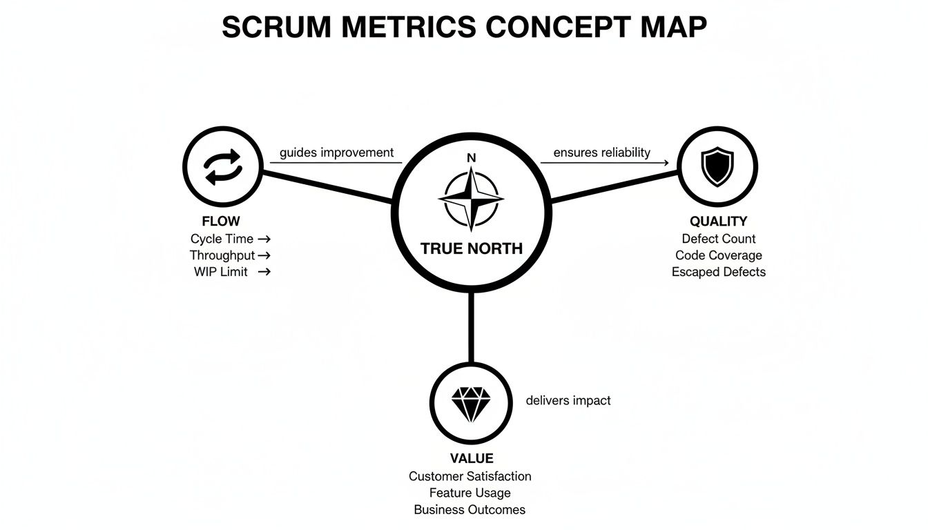
As the map illustrates, you need all three. Neglecting any one area creates an unsustainable system where teams either burn out trying to keep up or ship features that nobody actually wants. This guide will dive deep into specific metrics within each of these pillars, giving you a complete toolkit for your team.
Ultimately, metrics should serve one primary purpose: to trigger meaningful conversations. Data doesn't provide answers; it provides better questions that lead to collaborative problem-solving and genuine improvement.
Once you adopt this mindset, you can move past surface-level tracking and start a much deeper exploration of your team's real potential. These ideas are fundamental to understanding not just Scrum but also the wider principles of engineering productivity measurement.
Throughout this guide, we'll give you the practical knowledge to use these instruments effectively, making sure your team is always sailing in the right direction.
Before we dive in, here’s a quick overview of the core metrics we’ll be covering. Think of this as your cheat sheet for understanding what each metric is for and what it tells you.
Quick Guide to Core Scrum Metrics
| Metric | Primary Purpose | Key Question Answered |
|---|---|---|
| Velocity | Measures the average amount of work a team completes during a sprint. | How much work can we realistically commit to in the next sprint? |
| Sprint Burndown | Tracks the progress of work remaining against time in a sprint. | Are we on track to complete our sprint goal? |
| Cycle Time | Measures the time from when work begins on a task to when it's done. | How long does it take us to complete a single piece of work? |
| Lead Time | Measures the total time from when a request is made to when it's delivered. | How long do our customers have to wait for their requests? |
| Work in Progress (WIP) | Counts the number of tasks being worked on at the same time. | Are we focused, or is our attention spread too thin? |
| Escape Rate | Measures the number of bugs found in production after a release. | How effective is our quality assurance process? |
| PR Review Time | Tracks the time a pull request waits for review and approval. | Is our code review process a bottleneck? |
This table gives you a starting point. As we go through each one, we’ll break down how to measure it, what to watch out for, and how to use it to spark those all-important team conversations.
For a lot of Scrum teams, planning feels like glorified guesswork. Stakeholders are asking for hard deadlines, but the team knows that curveballs are just part of the game. This is where output metrics come in. They build a bridge between guessing and knowing, turning your planning process from a high-stakes bet into a data-driven forecast based on what your team has actually done.
These metrics aren't about judging how "productive" anyone is; they're about finding a predictable rhythm. When you understand what your team has consistently delivered in the past, you can create a much more reliable forecast for what's coming next. It's a game-changer for building trust and making commitments you can actually stand behind.
Velocity: The Compass for Future Sprints
Velocity is probably one of the most famous—and most misunderstood—metrics in Scrum. At its core, it's simple: velocity is the average amount of work a team gets done in a sprint, usually measured in story points. It’s not a target to hit or a stick to compare teams with.
Think of velocity as your team's planning compass. After a few sprints, you can figure out an average that reflects your team's real, sustainable capacity. This average is an incredibly valuable guide during sprint planning, helping the team answer that critical question: "How much work can we realistically pull in for the next sprint?"
A stable velocity is the bedrock of predictability. It allows a Product Owner to forecast multi-sprint initiatives and give stakeholders a realistic release window, turning "it'll be ready when it's ready" into a confident, data-backed projection.
Let's say a new team finishes 20, 25, and 22 story points in their first three sprints. Their average velocity is 22.3. When they sit down for the next sprint planning, they can feel pretty good about committing to around 22 points of work, knowing it lines up with what they've proven they can handle. This historical data is powerful; in fact, early Scrum teams at companies like Yahoo that meticulously measured velocity saw productivity jump by 400% and work quality increase by up to 250% compared to industry baselines. You can explore the full findings on hyper-productive teams here.
Sprint Burndown Charts: Your Daily Pulse Check
While velocity is fantastic for looking ahead, the Sprint Burndown Chart is your in-the-moment navigation tool. This is a simple visual that tracks the work remaining against the time left in the sprint. The vertical axis shows your total committed story points, and the horizontal axis shows the days of the sprint.
In a perfect world, the line showing remaining work "burns down" in a steady march toward zero. It’s a daily pulse check, giving you instant feedback on whether the team is on track to hit the sprint goal. A good Scrum Master will have this chart up during daily stand-ups to spark important conversations.
What a Burndown Chart Reveals:
*   **A steep drop:** The team might have overestimated a task's complexity. Good to know for next time!
*   **A flat line:** This is a huge red flag for a blocker. Something is stuck, and the team needs to swarm on it right away.
*   **A line trending upward:** Whoops, scope creep. Someone added new work to the sprint, putting the original commitment at risk.
While story points are useful, knowing how to measure employee productivity effectively can offer deeper insights for planning. The burndown chart adds crucial daily context to that plan. It shifts the focus from what individuals are doing to the team's collective progress toward a shared goal. By making progress—or the lack of it—so visible, the burndown chart empowers the team to self-organize and adapt on the fly, making sure there are no nasty surprises on the last day of the sprint.
Optimizing Your Workflow With Essential Flow Metrics
While output metrics are great for planning, flow metrics are all about perfecting the journey. They are the secret to unlocking a smooth, efficient, and predictable development process by showing you how work actually moves through your system. Instead of just counting what came out at the end, flow metrics diagnose the health of your workflow from start to finish.
Think of your team as a high-end restaurant kitchen. Output metrics might tell you how many dishes you served. Flow metrics, on the other hand, tell you how long a customer waited, how long the chefs took to cook the meal, and whether the kitchen was a scene of calm focus or pure chaos.
This distinction is everything. By optimizing your flow, you create a sustainable pace, reduce developer stress, and build a delivery pipeline that stakeholders can actually rely on. It’s about creating a system where work glides through, rather than being painfully pushed and pulled through bottlenecks.
Cycle Time And Lead Time: Understanding The Full Journey
Two of the most fundamental flow metrics are Cycle Time and Lead Time. They’re often confused, but they measure two distinct—and equally important—parts of your process.
Let’s go back to our restaurant. Lead Time starts the second a customer places their order. It covers the entire experience, from the initial request to the final delivery. In Scrum, this is the total time from when an item hits the backlog until it’s live in production.
Cycle Time, however, starts when the chef actually begins cooking. This is the "active work" phase. For a development team, it measures the time from when an engineer starts working on a task to when that work is considered done.
This isn't just semantics; it reveals different kinds of problems. A long Lead Time but a short Cycle Time tells you that work is sitting idle in your backlog for way too long. On the flip side, a short Lead Time but a long Cycle Time could mean your active development process is riddled with delays and context switching.
Cycle time is a cornerstone flow metric that tracks the duration from when work begins on a PBI to its completion. Teams leverage historical cycle time data to forecast future performance, with hyperproductive Scrum teams achieving dramatic reductions that enable productivity uplifts of over 400%. Despite its importance, 27% of teams falter in Agile transformations due to undefined metrics like cycle time. Discover more insights about these Scrum metrics on monday.com.
This table breaks down the key differences between these two critical flow metrics.
Flow Metrics Cycle Time vs Lead Time
| Aspect | Cycle Time | Lead Time |
|---|---|---|
| Start Point | An engineer starts working on a task. | A task is first created or requested. |
| End Point | The task is completed and ready for delivery. | The completed task is delivered to the customer. |
| What It Reveals | The efficiency of your active development process. | The entire customer experience, including wait time. |
| Key Question | "How fast can we build this once we start?" | "How responsive are we to a new request?" |
By tracking both, you get a complete, holistic view of your workflow’s health. If you're looking for practical ways to improve, check out our guide on 7 proven strategies to reduce cycle time.
Work In Progress (WIP): The Power Of Focus
The final piece of the flow puzzle is Work in Progress (WIP). It's simply the number of tasks your team is actively working on at any given moment. It might feel productive to have a lot of things moving at once, but high WIP is one of the biggest killers of flow.
Let's be clear: multitasking is a myth for development teams. When engineers are constantly juggling different tasks, they lose precious time and mental energy to context switching. This overhead slows everything down, increases the chance of errors, and makes Cycle Times longer for every single item.
This is where WIP limits come in. A WIP limit is an explicit rule that restricts how many items can be in a specific stage of your workflow at one time. For example, a team might set a WIP limit of three for their "In Progress" column.
Here’s why that’s so powerful:
*   **It Exposes Bottlenecks:** When a column hits its WIP limit, no new work can be pulled in until something moves out. This immediately shines a massive spotlight on where work is getting stuck.
*   **It Encourages Collaboration:** To clear that bottleneck, the team has to swarm on the blocked item together. This builds a powerful culture of collective ownership.
*   **It Improves Focus and Quality:** With fewer tasks in play, developers can give each one their full attention, which almost always leads to higher-quality code and fewer mistakes.
*   **It Shortens Cycle Time:** By focusing on finishing tasks before starting new ones, the time it takes to complete each item naturally goes down.
By mastering Cycle Time, Lead Time, and WIP, you give your team the tools to stop starting and start finishing. This simple shift in mindset is one of the most effective ways to build a truly agile, predictable, and high-performing team.
Shipping features fast is great, but it’s a hollow victory if the product is riddled with bugs. A high velocity score doesn't mean much if you’re losing user trust with every release. Quality and stability metrics are like your codebase's immune system—they keep an eye on its health and shield it from defects that wreck the user experience.
These metrics change the conversation from "how fast are we building?" to "how well are we building?" They act as a vital counterbalance to raw output, making sure your team is creating a resilient and reliable product. Ignore them, and you’ll just be racking up technical debt that eventually brings all progress to a screeching halt.
Escape Rate: The Ultimate Test of Your Quality Process
One of the most telling signs of your codebase's health is the Escape Rate, which you might also hear called Defect Density. This metric tracks the number of bugs that "escape" your development and testing process and get found by actual users in production. It’s the final exam for your quality assurance net.
A high escape rate is a massive red flag. It tells you something in your process is broken. Maybe your automated test coverage is thin, manual testing is getting rushed, or your team's definition of "Done" just isn't cutting it.
A rising Escape Rate is a leading indicator of future slowdowns. Every bug found in production requires unplanned work, pulling developers away from new features to fight fires. This reactive cycle is a major drain on team capacity and morale.
Watching this metric over time gives you priceless feedback. A consistently low or falling escape rate is a clear sign your team's quality practices are maturing. It directly reflects a healthy engineering culture that puts stability first.
Connecting Code Reviews to Code Quality
While Escape Rate is a lagging indicator—it tells you about problems after they’ve happened—other metrics can give you a heads-up. Two of the most critical are Pull Request (PR) Review Time and PR Size. What happens in your daily development workflow has a direct, significant impact on the quality of your code.
Think about it: huge, complex PRs are a nightmare to review thoroughly. When a reviewer is staring down thousands of lines of changes, it's incredibly easy to miss subtle bugs, logical flaws, or sloppy code. Unsurprisingly, these monster PRs often sit for days, waiting for someone brave enough to even start.
This delay creates a nasty combination:
*   **Longer Review Times:** The PR becomes a bottleneck, holding up other work and dragging down the team's entire cycle time.
*   **Increased Defect Risk:** When reviews on large PRs are rushed or superficial, more defects inevitably slip through into the main branch.
*   **Developer Frustration:** Engineers get stuck waiting for feedback, forcing them to switch context and killing their productivity.
By focusing on keeping PRs small and focused, teams can dramatically speed up the review process. Smaller changes are just plain easier to understand, quicker to review, and far less likely to hide nasty surprises. This kicks off a virtuous cycle where faster feedback loops lead directly to higher-quality code. To dig deeper into this, you might be interested in our guide on key metrics for faster code reviews in GitHub.
The data doesn't lie: teams that streamline their PR process see a direct improvement in their stability metrics. When you measure and improve PR review time and size, you're not just clearing a bottleneck; you're actively strengthening your codebase’s immune system and stopping bugs before they ever get a chance to escape.
Building Your Scrum Metrics Dashboard
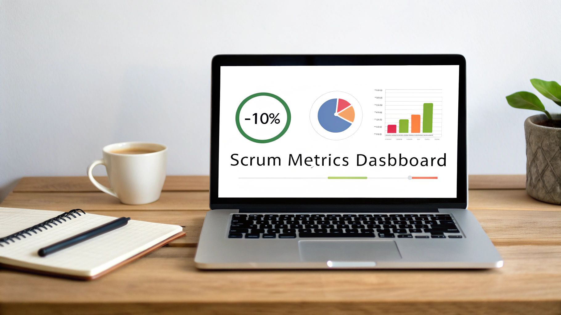
Tracking individual metrics in Scrum is one thing, but if that data is scattered across a dozen different spreadsheets and tools, it’s not doing you much good. To really turn those raw numbers into something useful, you need to get them in front of everyone on the team. This is where a solid Scrum metrics dashboard comes in—it's the team's command center for performance and health.
A great dashboard tells a story. It doesn’t just spit out numbers; it shows trends, highlights what’s working (and what’s not), and sparks the right conversations. Think of it as the difference between a pile of engine parts and a running motor with a full diagnostic display.
Starting Simple With Tools You Already Use
You don't need a fancy, expensive business intelligence tool right out of the gate. The best way to get started is to build a "version one" dashboard using the tools you already have. Keep it simple and build from there.
Your project management tool—like Jira or Azure DevOps—is the perfect place to start. These platforms are already tracking a lot of these metrics and have built-in reporting features ready to go.
You can whip up a surprisingly effective dashboard with just a few key charts:
*   **A Velocity Chart:** Pin a chart showing the last **5-7** sprints. This gives you a clear trend line and helps calculate a stable average for planning.
*   **A Sprint Burndown Chart:** Put the current sprint's burndown front and center. It keeps daily stand-ups focused and helps the team be proactive about hitting their goal.
*   **Cycle and Lead Time Control Charts:** These built-in reports are great for spotting outliers and seeing just how predictable your workflow is.
Just by putting these widgets on a shared dashboard, you create a single source of truth. This simple act of making data transparent is often the biggest first step toward building a culture of continuous improvement.
Automating Data Collection With Specialized Tools
As your team gets more comfortable with metrics, pulling data by hand and updating spreadsheets will start to feel like a real chore. This is the time to bring in specialized tools that can automate data collection and create much richer dashboards. These tools plug right into your existing systems and give you a much deeper, more complete view of team health.
For teams ready to take their visualizations to the next level, learning how to create a Power BI dashboard is a great next step. Tools like this can pull data from multiple sources to paint the full picture.
The point of automation isn't just about saving time. It's about unlocking real-time insights. When the data is always fresh, it becomes part of the daily conversation, not just something you look at in a monthly report.
A perfect example is integrating a tool like PullNotifier with your GitHub and Slack workflow. Instead of manually digging through PRs to track review times, you get instant visibility right where the team is already working. This kind of real-time feedback loop turns an abstract metric like PR Cycle Time into something tangible the team can talk about every day, making it easy to spot and fix bottlenecks as they happen.
Tailoring Dashboards for Different Audiences
One dashboard almost never fits all. Different people need to see different things to do their jobs well. A much better approach is to create a few tailored views for each audience.
*   **The Team Dashboard:** This is the ground-level, day-to-day view. It should be all about the current sprint—think burndown charts, WIP limits, and real-time PR statuses. The goal here is to help the team manage the sprint and clear immediate blockers.
*   **The Scrum Master Dashboard:** This view is all about process health. It should track trends over several sprints, looking at things like velocity stability, cycle time consistency, and how many stories actually get completed. This data is pure gold for facilitating effective retrospectives.
*   **The Engineering Manager Dashboard:** This dashboard is more strategic. It might show quality metrics like escape rate and change failure rate, alongside the overall lead time from idea to delivery. It helps managers spot systemic problems and guide bigger-picture improvements.
By creating these separate views, you make sure everyone gets the information they need without getting buried in data they don't. It keeps the metrics focused, meaningful, and most importantly, actionable.
How to Avoid Common Pitfalls and Anti-Patterns
Metrics are a double-edged sword. Used correctly, they light the way to genuine improvement. Used incorrectly, they'll burn your team's culture to the ground. Even with the best intentions, measurement can quickly become a source of fear and dysfunction if you aren't careful.
The secret is to treat metrics as diagnostic tools for the team, not judgment tools for management.
The second that data is used to punish or reward individuals, the system breaks. Helpful signals morph into targets to be gamed, and you can kiss the trust needed for real agile development goodbye.
Weaponizing Metrics to Compare Teams
One of the fastest ways to kill morale is to use metrics like velocity to compare individuals or teams. This is a classic mistake because metrics like story points are relative. Each team’s estimation scale is unique to their own context, skills, and the complexity of the work they handle.
Comparing Team A’s velocity of 40 to Team B’s 25 is completely meaningless. It’s like trying to compare the speed of a car in miles per hour to a boat in knots—they’re not even measuring the same thing. This always leads to toxic competition, story point inflation, and a team focused on looking busy instead of actually delivering value.
A team's metrics are for that team's self-improvement. When you use them for comparison, you create a culture of fear where teams will optimize for the metric at all costs, even if it means sacrificing quality or collaboration.
Instead of comparing raw numbers between teams, look for trends within a single team. Is their velocity starting to stabilize? Is their cycle time becoming more predictable? These internal patterns are where the real insights are hiding.
The Danger of a Single Metric
Another common trap is getting fixated on a single "vanity" metric. Chasing a higher velocity is the textbook example. A team might successfully crank up their velocity sprint after sprint, and that chart will look amazing to management. But if it's coming at the cost of quality, what have they really accomplished?
This laser focus on one number can lead to some pretty disastrous outcomes:
*   **Skyrocketing Defect Rates:** Teams start cutting corners on testing just to shove more story points out the door, leading to a flood of escaped bugs hitting production.
*   **Growing Technical Debt:** In the rush to complete tasks, code quality gets thrown out the window. This creates a fragile, messy codebase that will slow everyone down later.
*   **Team Burnout:** A relentless, unsustainable push for "more, more, more" leads to exhaustion, frustration, and rock-bottom morale.
The solution is to use a balanced set of metrics in scrum. Pair an output metric like velocity with a quality metric like escape rate and a flow metric like cycle time. This holistic view ensures that speed doesn't destroy stability, which is the only way to build a healthy and sustainable development process.
Got Questions About Scrum Metrics?
Diving into data always brings up a few questions. Let's tackle some of the most common ones that pop up when teams start tracking their work in Scrum.
How Often Should We Be Looking at Our Metrics?
Metrics are most valuable when you review them consistently during your Sprint Retrospectives. They're not meant for daily micromanagement. This rhythm lets the team spot actual trends and make meaningful process improvements based on what the data is showing. Think of it as a regular check-up, not constant surveillance.
Is There One "Most Important" Metric?
Nope. Relying on a single metric will give you a skewed picture of your team's health. The best approach is to look at a balanced set of numbers. When you combine an output metric (like Velocity), a flow metric (like Cycle Time), and a quality metric (like Escape Rate), you get a holistic view. This prevents you from accidentally improving one area while another one suffers.
Can We Compare Velocity Between Two Different Scrum Teams?
That’s a hard no. Story points are relative estimates, and they're completely unique to each team’s context, skills, and how they define complexity. Comparing velocity between teams is like comparing apples and oranges—it’s misleading, sparks unhealthy competition, and offers zero real insight into performance.
Ready to eliminate code review bottlenecks and gain real-time visibility into your PR process? PullNotifier integrates with GitHub and Slack to deliver concise, actionable updates that cut review delays by up to 90%. Start streamlining your workflow today by visiting https://pullnotifier.com.